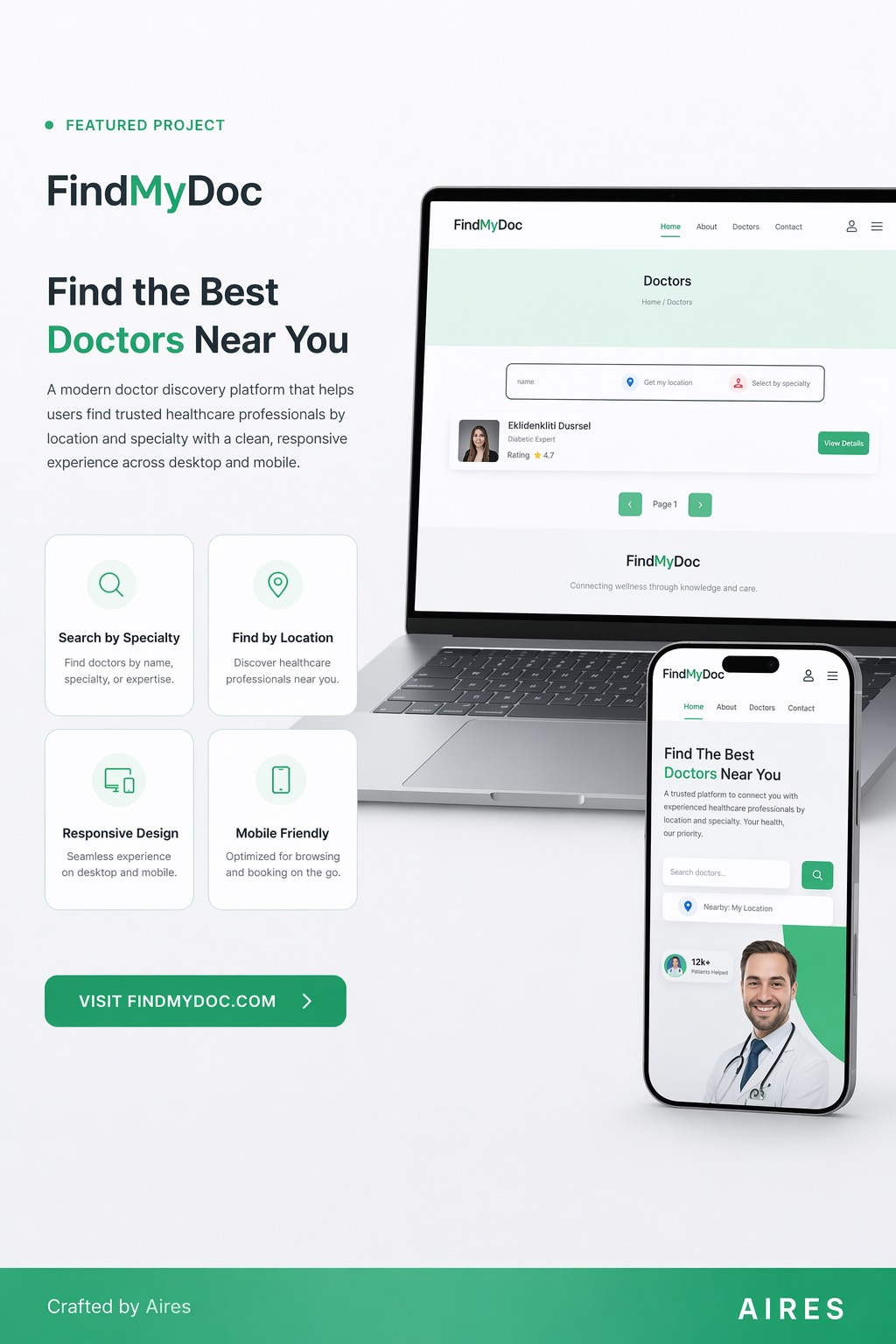
A doctor discovery platform with a search and filter UX designed to help patients find the right provider without feeling overwhelmed.
Finding a doctor online is a high-stakes, high-anxiety experience. Patients don't know medical terminology, don't understand insurance networks, and are often searching during a stressful moment. Existing tools felt like they were built for administrators, not patients.
I started with the user's actual language. People search for 'knee pain doctor near me', not 'orthopedic specialist.' The search and filter system was built around plain-language inputs with progressive filtering — broad at first, narrowing down by availability, insurance, and location only after an initial result set is visible.
The search box accepts symptoms and plain descriptions ('back pain', 'kids doctor', 'mental health') and maps them to specialties on the backend. Users don't need to know the difference between a physiatrist and an orthopedist.
Each provider card surfaces: name and specialty, location and distance, next available appointment, and insurance accepted — in that order. Everything a patient needs to decide is visible before clicking through. Secondary details (education, reviews) are on the profile page.
Filters are grouped by decision priority: insurance first, then availability, then location radius. Filters that return zero results are disabled rather than hidden, so users understand why they're not seeing options.
When no results are found, the empty state explains why and suggests two clear next steps: broaden the search or check insurance. No dead ends.
The platform connected patients with providers in their area using a flow that tested well with users who had no prior experience with health search platforms. Task completion rate for 'find a doctor accepting my insurance' was above 80% in usability testing.
See more