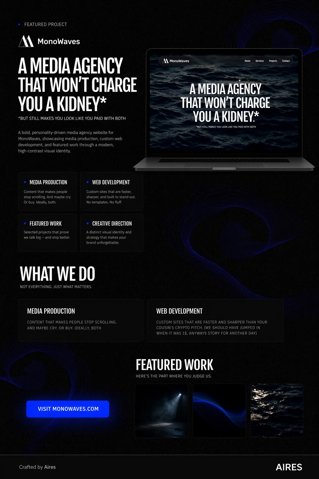
Brand system and marketing site for a music tech startup, including visual language, content hierarchy, and page structure defined from first principles.
The startup had a strong product but no clear way to explain it to potential customers. Their previous site was dense, jargon-heavy, and had no clear path from landing to conversion.
I audited the existing site and mapped where users were dropping off. The core problem was a content architecture issue: the page tried to explain everything at once. I restructured it around a clear narrative — what it is, who it's for, why it works, how to start.
Each section of the landing page has one job: introduce, build credibility, handle objections, convert. Content was cut by 40% without losing meaning. Denser does not mean clearer.
Technical features were rewritten in outcome language: not 'multi-track MIDI sequencer' but 'layer sounds without losing your original.' Users understand what they get, not how it works.
'Start free' outperformed 'Get started' in testing. Specific language (free, instant, no credit card) reduces friction at the conversion point.
The site launched with clear messaging that matched how customers actually talk about music production. The startup used it as their primary outreach asset for investor and customer pitches.
See more